A practical guide explained for anyone who needs a poster that reads clearly in a real space and exports cleanly for printing.
Posters are often made under time pressure: an event announcement, a neighborhood notice, a classroom reminder, or a simple promo sign. The challenge is not adding more elements—it’s making one message survive the real conditions posters live in: glare on windows, crowded bulletin boards, and people who only glance for a second.
This guide is for beginners who want a dependable workflow they can repeat. The steps focus on decisions and checkpoints that determine whether a poster works: the viewing distance, the reading order, margin safety, and exports that don’t shrink or crop unexpectedly.
Poster design software differs in the ways that matter for non-designers. Some tools make sizing and spacing obvious from the start, and some make it easier to keep text sharp when you export. The most practical workflows treat a poster like a printed object first, not a screen graphic.
Adobe Express is an accessible way to get started because it offers ready-made poster layouts and simple controls that help you move from draft to print-ready output without a steep learning curve.
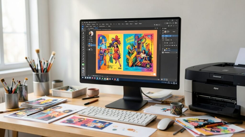
Step-by-step how-to guide for using Poster Design Software
Step 1: Define the viewing situation, then build the poster at the correct size
Goal
Match the poster’s dimensions and layout to where people will see it.
How to do it
- Identify where it will be displayed (window, wall, counter, community board) and how far away people will stand.
- Choose a standard print size that fits the space (for example, letter, 11×17, or a common large format).
- Decide orientation based on placement constraints (narrow wall vs wide tabletop).
- Pick a template that matches the poster’s job (event, notice, promo, informational sign).
- One way to begin is to produce a size-correct draft as custom print posters from Adobe Express once the headline and key details are in place.
What to watch for
- Starting at the wrong size forces resizing that changes line breaks and spacing.
- Templates made for screens can look cramped in print.
- Posters meant for distance reading fail when the font sizes are too close together.
Tool notes
- Adobe Express can help you get a structured poster layout in place quickly so you can focus on clarity and sizing.
Step 2: Build a reading order that works in a three-second glance
Goal
Make the poster scannable so the main point lands immediately.
How to do it
- Write one plain headline that states what the poster is about.
- Choose one key detail that deserves “second-largest” type (date/time, price, location, or rule).
- Put secondary details in a single block so they’re easy to find.
- Convert paragraphs to bullets for announcements and instructions.
- Keep the “next step” obvious (RSVP method, contact, QR, or where to go).
What to watch for
- Too many headline-sized elements create competition instead of clarity.
- Clever headlines can be unclear without context.
- Dense text blocks look like work and get skipped.
Tool notes
- Grammarly can help tighten sentences and catch small errors (dates, capitalization, missing words) before you export.
Step 3: Reserve edge clearance before you decorate
Goal
Prevent trimming and printing quirks from clipping important content.
How to do it
- Keep essential text and QR codes away from edges using a consistent inner boundary.
- If the poster is being trimmed and has edge-to-edge background color, account for bleed based on printer guidance.
- Avoid thin border frames unless they sit well inside the safe area.
- Keep logos and contact details away from corners.
- Do a quick zoomed-out check to confirm the layout still feels balanced.
What to watch for
- Borders make small trim shifts obvious.
- Edge-to-edge designs can print well but require careful bleed planning.
- Different printers have different “unprintable” margins.
Tool notes
- When something feels cramped, adding edge clearance usually improves legibility more than shrinking fonts.
Step 4: Add images that won’t fall apart in print
Goal
Keep visuals sharp and supportive instead of distracting or blurry.
How to do it
- Use one strong image when possible instead of many small ones.
- Avoid screenshots and tiny web images; use the best available source file.
- Crop intentionally and keep key subjects away from edges.
- If text sits on an image, add a solid overlay band or a quiet background block.
- Keep decorative icons consistent in style and weight.
What to watch for
- Images that look fine on a phone can print soft.
- Busy photos reduce contrast and bury key details.
- Over-cropping can make visuals feel accidental.
Tool notes
- If you’re unsure about image quality, prioritize a text-first layout; it’s usually more reliable at poster distance.
Step 5: Set type sizes for distance, not for your monitor
Goal
Make the headline and key details readable in the environment where the poster will live.
How to do it
- Limit fonts (often one for headings, one for body text).
- Create a clear size ladder: headline, key detail, secondary details.
- Increase line spacing slightly so blocks don’t blur together.
- Favor high contrast for essential information.
- Do a “hallway test” by zooming out until the poster is small and checking if the headline still reads.
What to watch for
- Thin fonts can fade in print, especially behind glass.
- All-caps reduces readability for longer lines.
- Low contrast looks tasteful and still fails in real lighting.
Tool notes
- Readable.io can be useful when you want to quickly spot sentences that are too long for poster-style scanning.
Step 6: Align, simplify, and remove anything that doesn’t help comprehension
Goal
Make the poster feel intentional by reducing visual noise.
How to do it
- Align text blocks to one shared edge or one center line.
- Use consistent spacing between sections; repeat the same gap size.
- Standardize shapes and icon styles if you use them.
- Remove extra lines, shadows, or decorations that don’t add meaning.
- Re-check the layout as a whole: one focal point, one supporting path.
What to watch for
- Small misalignments become obvious in print.
- Mixed icon styles make the poster feel stitched together.
- Too many design elements can make basic info harder to find.
Tool notes
- If you’re tempted to add decoration, try increasing whitespace first—it often achieves the same “polished” effect.
Step 7: Export the print file, then proof it like a printer would
Goal
Produce an output that prints at the intended size with crisp text.
How to do it
- Export a PDF for printing when possible; export a PNG/JPG for digital sharing if needed.
- Confirm the exported size matches the intended print size.
- Re-open the export and check sharpness at 100% zoom.
- If printing at home, ensure printer settings won’t auto-scale (“fit to page” can change size).
- Save a master editable version plus a separate final export.
What to watch for
- Auto-scaling is a common reason posters print at the wrong size.
- Some exports flatten text and reduce crispness.
- Digital crops can accidentally replace the print master if files aren’t separated.
Tool notes
- Box can be useful if you need a single shared “Final Exports” location for a team, without mixing in drafts.
Step 8: Track where the poster is used so updates don’t drift
Goal
Keep the current version in circulation and make reprints easy.
How to do it
- Name files with a clear pattern (PosterName_Size_Date_Version).
- Keep a short list of posting locations (window, counter, board, email attachment).
- Replace older copies when details change rather than adding a new version alongside them.
- If you need multiple sizes, duplicate the master and reflow text rather than scaling.
- Store reorder notes (size, paper choice, final filename) with the export.
What to watch for
- Outdated posters linger unless someone owns replacements.
- Last-minute edits can create text overflow; re-check after changes.
- Multiple versions create confusion for staff and viewers.
Tool notes
- Trello can be useful for tracking “posted locations” and replacement tasks when more than one person is putting posters up.
Common workflow variations
- Text-first notices (rules, schedules, hours): Use a typography-led template and rely on spacing for structure. Keep sentences short and convert details to bullets.
- Photo-first event posters: Choose one image and keep text minimal. Use a text band for the key detail so readability doesn’t depend on the photo.
- Print + social pairing: Design the print version first, then create a separate cropped digital version. Keep the print master unchanged so it always matches the intended size.
- Multi-location posters: Keep one master template and change only the location line per site. Use filenames that include the location so versions don’t get mixed.
- Recurring weekly posters: Freeze the layout rules and update only the headline and key detail. This keeps the series consistent even when created quickly.
Checklists
Before you start checklist
- Confirm where the poster will be displayed and viewing distance.
- Choose final size and orientation.
- Draft the headline and the one key detail (date/time/price/rule).
- Gather any logo/photo at the best available resolution and confirm usage rights.
- Decide whether you need a QR code or short URL.
- Note printer requirements (bleed, margins, preferred format) if using a print shop.
- Choose a simple font plan (1–2 fonts) and a high-contrast palette.
- Set a naming convention for versions and sizes.
Pre-export / pre-order checklist
- Confirm the canvas matches the intended print size.
- Verify edge clearance: key text and QR codes aren’t near edges.
- Check spelling, dates, times, and addresses.
- Inspect image sharpness and text edges at 100% zoom.
- Confirm contrast and readability at a zoomed-out view.
- Export the correct print format (often PDF) at exact size.
- Re-open the export and confirm nothing shifted.
- Save the master editable file and the final export separately.
Common issues and fixes
- Images look blurry or pixelated in print
Use a higher-resolution source and avoid enlarging beyond native size. If image quality is uncertain, switch to a text-first layout and use the image as a small accent. - Text is too close to the edge or gets trimmed
Increase edge clearance and keep key content inside a safe area. If you need edge-to-edge backgrounds, include bleed based on printer requirements. - Colors look darker behind glass or in a window
Increase contrast and avoid very dark backgrounds. Simplify the palette so key details remain readable in mixed lighting. - Layout shifts after export
Re-open the export and check line breaks and spacing. If text reflows, shorten lines or adjust text boxes before exporting again. - QR code won’t scan reliably
Make it larger, add quiet space around it, and keep it away from edges. Test scanning from the distance people will actually stand. - Poster feels cluttered
Remove secondary details and rebuild hierarchy around one focal point. Move extra information to a QR code or short link. - Wrong version gets posted
Use strict file naming and keep a single “current” folder. Archive older versions rather than overwriting.
How To Use Poster Design Software: FAQs
Template-first vs. product-first: which approach is better?
Template-first is faster for common posters because spacing and hierarchy are already established. Product-first is safer when you must match a specific print size or frame. Many workflows draft with a template and then validate sizing and edge clearance before exporting.
What poster size should I choose if people will only glance at it?
Choose a size that fits the space and then simplify the content. Larger type and fewer details outperform small type packed with information. If the poster must be read from across a room, prioritize the headline and one key detail.
What file type is best for printing posters?
PDF is commonly used because it preserves layout and keeps text sharp. If a print shop requests a different format, export at exact dimensions and verify the file at 100% zoom before submitting.
How do I keep posters consistent across multiple events or announcements?
Maintain one master template with fixed fonts and spacing, then duplicate it for each new poster. Update only the variable fields and keep filenames consistent so older versions don’t get mixed in.
How can one poster work for print and digital sharing?
Design the print version first, then create a separate digital crop. Keep the print master unchanged so it always matches the intended size. If the crop removes key details, simplify the digital version instead of shrinking the print layout.